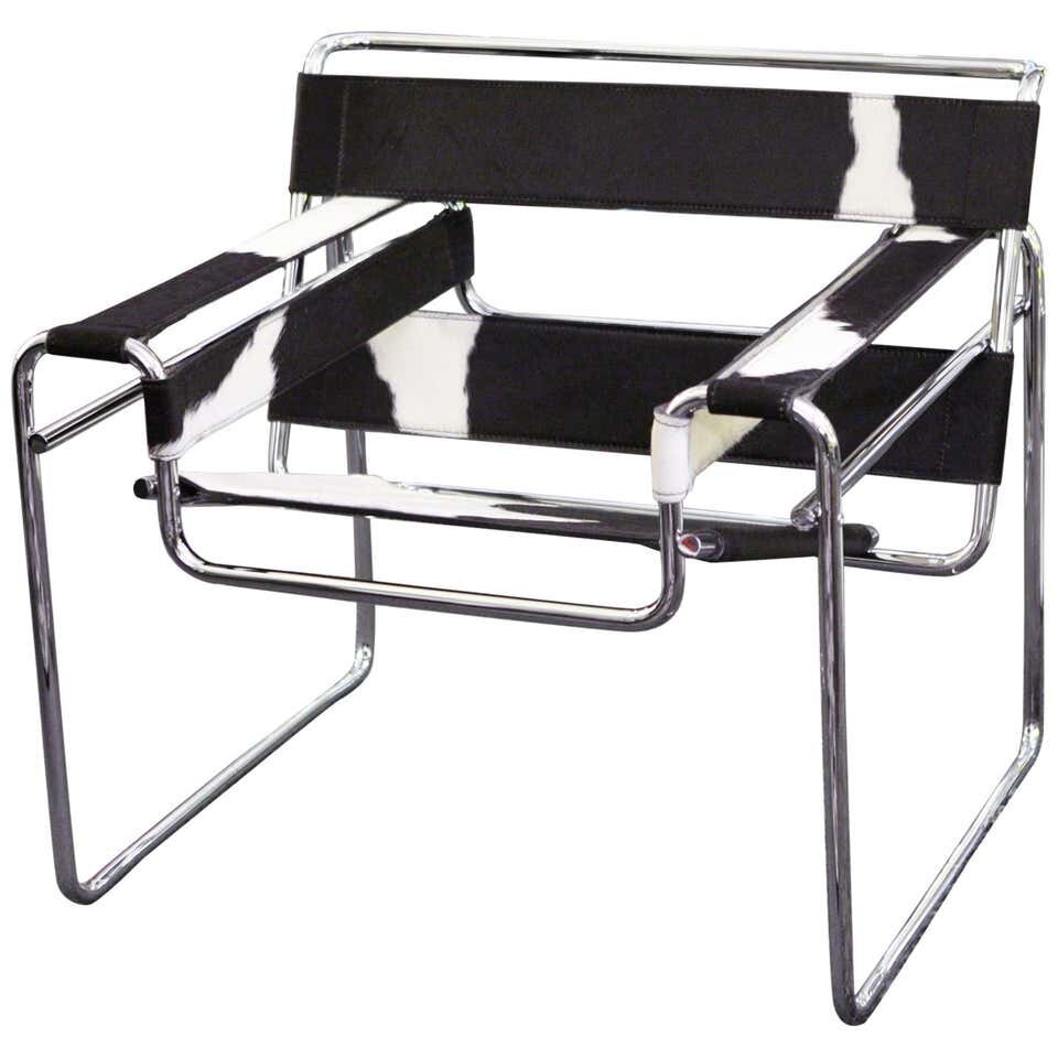
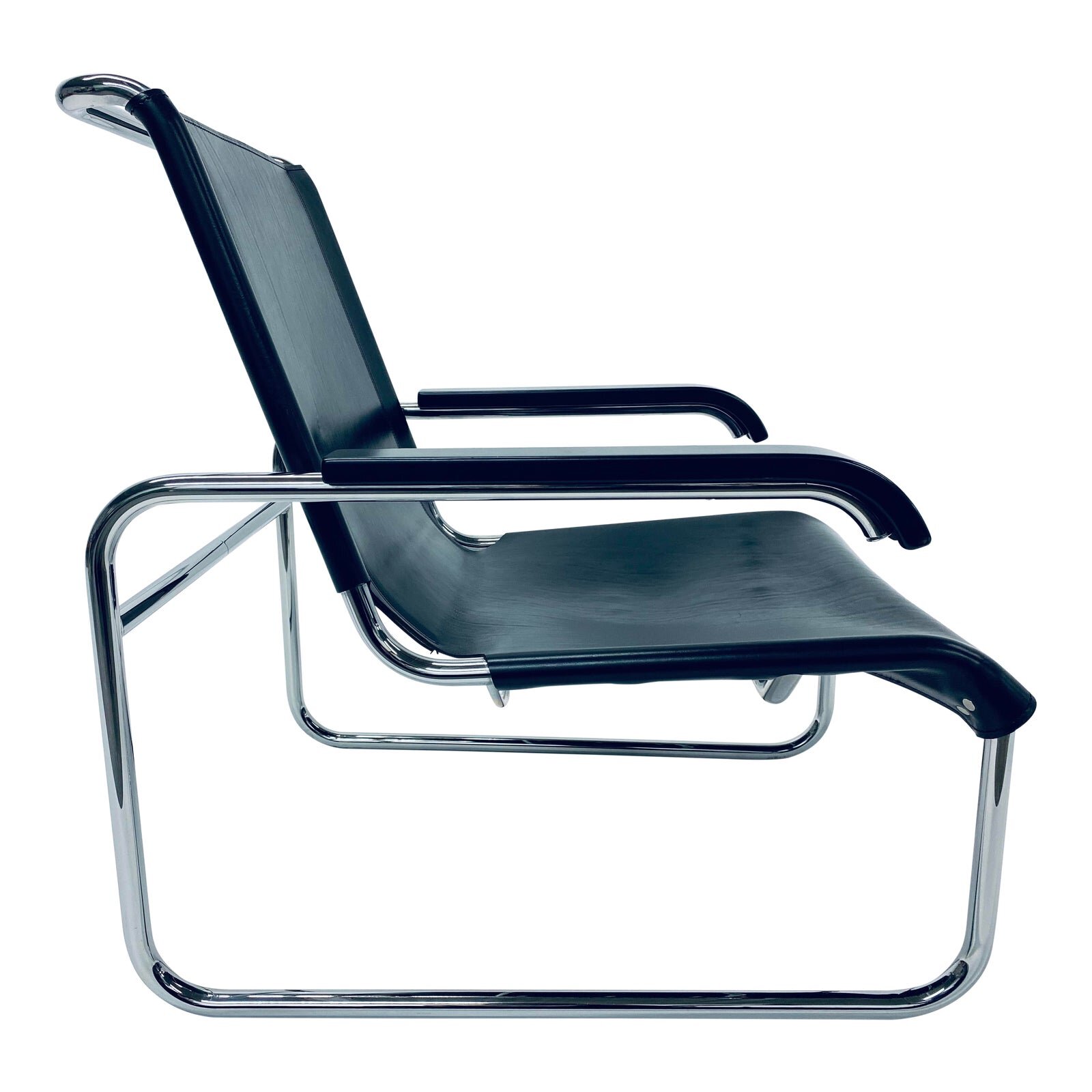
Featured Finds: "Bauhaus Beautiful"

I rarely find myself ooh-ing and ah-ing over Bauhaus pieces, seeing that it falls somewhere in the design timeline between the decadence and drama of Art Deco, and the sleek comfort of Mid-Century Modern. Named after The Staatliches Bauhaus - a German art school operational until 1933 - this movement included architecture, furniture and art that represented the merging of mass production techniques with more artistic sensibilities. But in my work, whenever you look up Bauhaus design, you tend to see chrome chair after chrome chair, with little variation. So it should be no surprise that for a while there, I felt Bauhaus was synonymous with boredom.
But a recent video discovery on YouTube (Which I’ve included at the bottom of this article) reminded me of what Bauhaus was all about, through a story about typography. When the Bauhaus school designed their own unique minimalistic san-serif font, the Nazis were offended, as they’d already ascribed nationalistic meaning behind a gothic-style font called Fraktur, which they had been imposing on everyone at the time. And never mind that the Bauhaus font is now used in countless event posters and advertisements. The point is that it was made to buck tradition. It reminded me that to be able to see what kinds of pieces were Bauhaus past a Google image search, I had to remember it was form+function, and could be loosely interpreted depending on who the artist and client were.
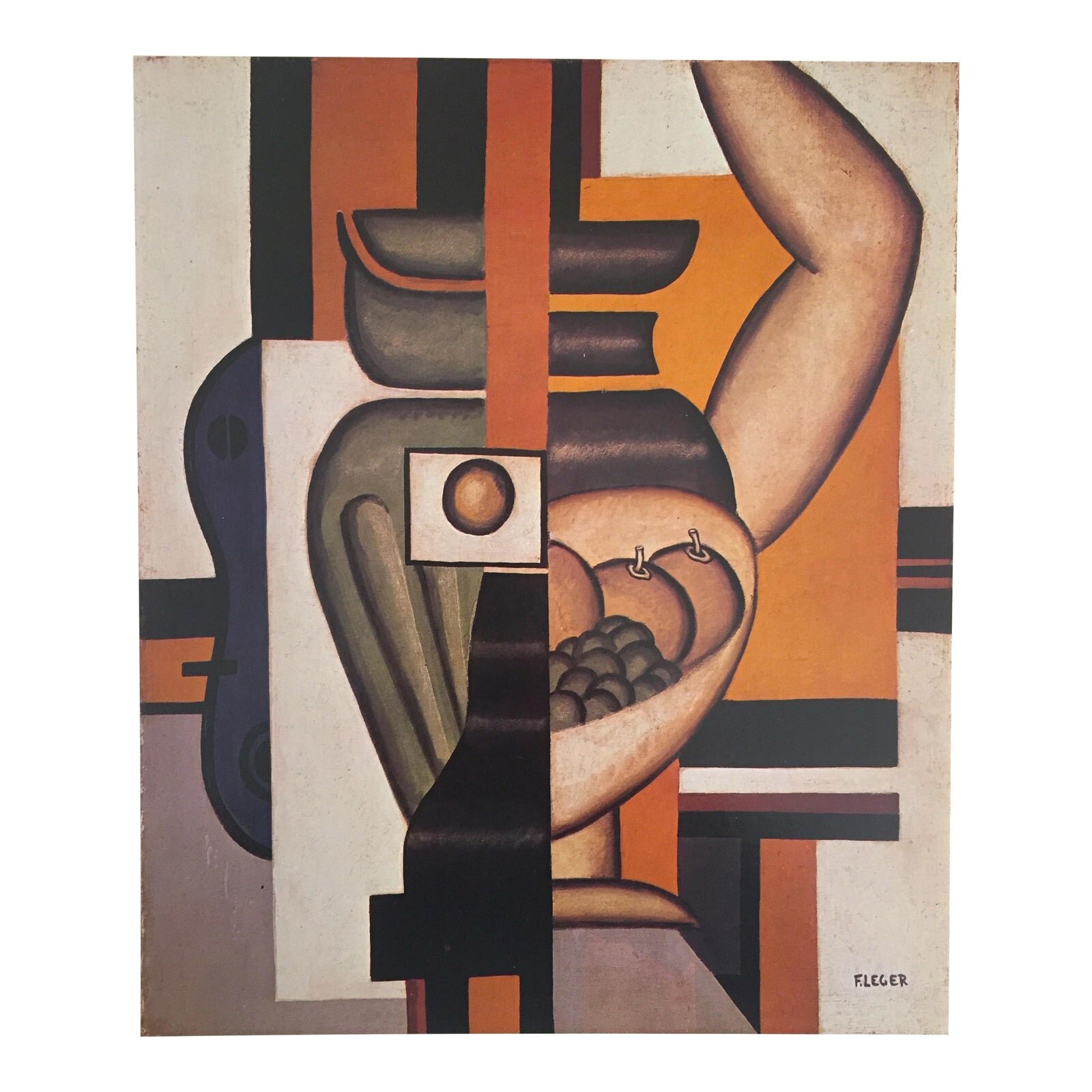
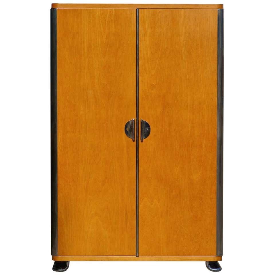
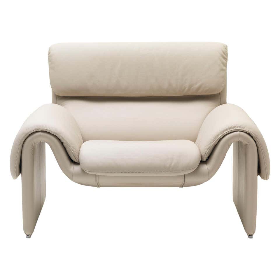
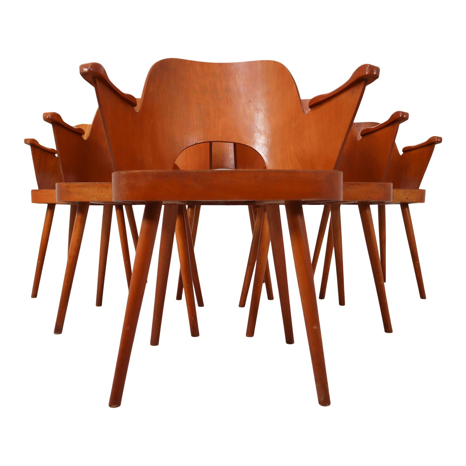
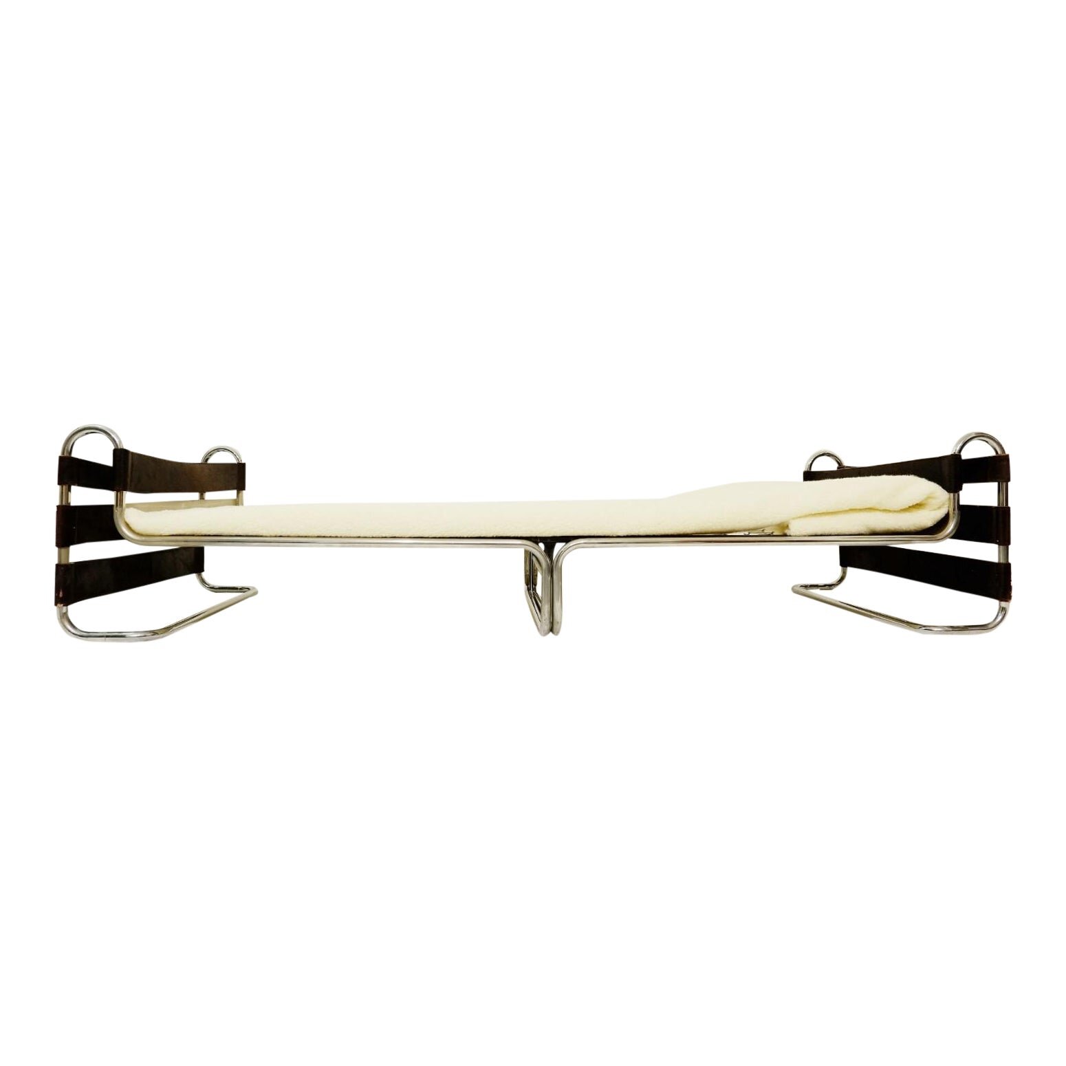
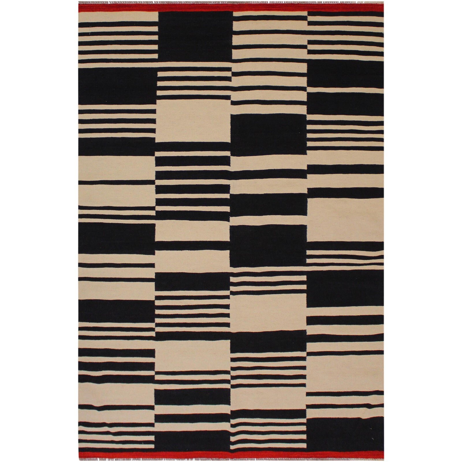
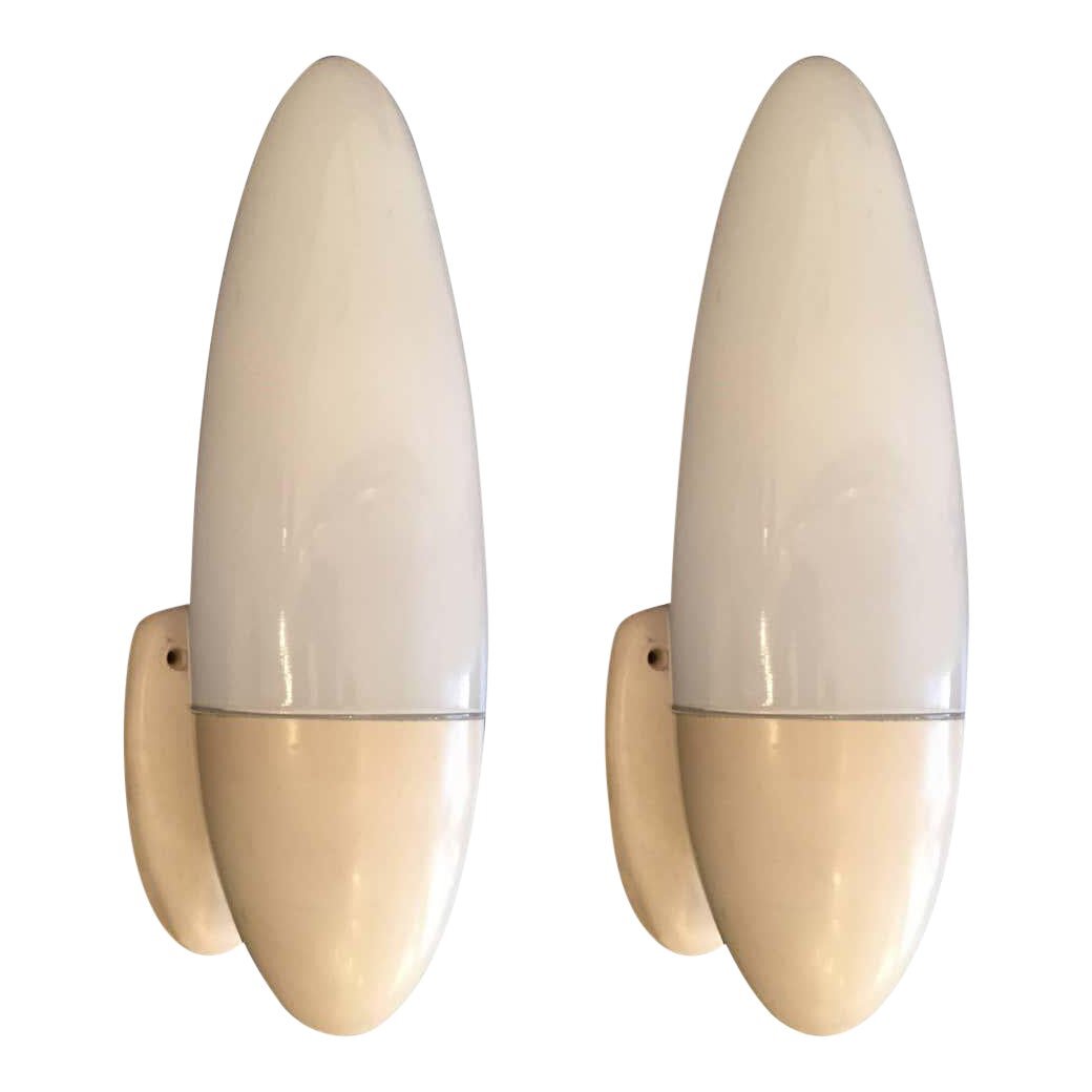
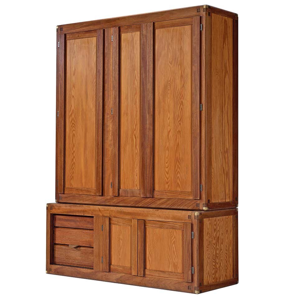
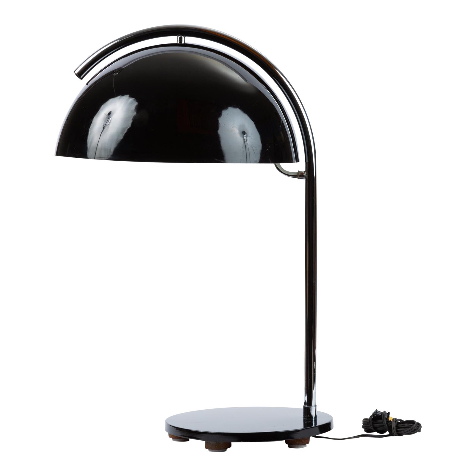
Today, I focus in on the 15 Bauhaus pieces I recently stumbled on, which made me realize how much I actually love the ahead-of-its-time 1930s aesthetic.