How This Laguna Beach Collector Successfully Merges the Worlds of Art and Design
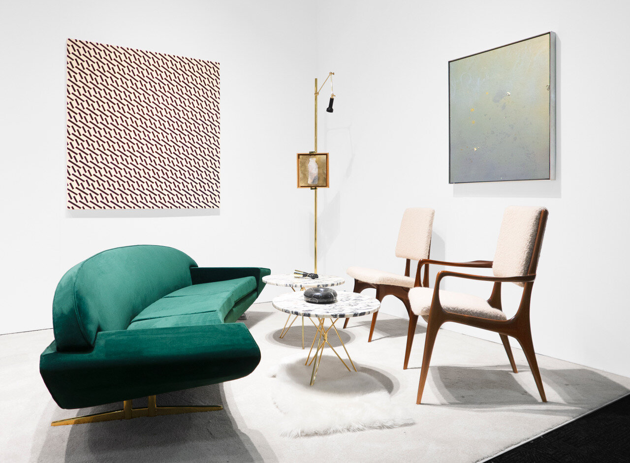
Photo Courtesy of Peter Blake Gallery
Back when Peter Blake was celebrating his promotion from server to general manager of iconic Laguna Beach eatery, Romeo Cucina, he found himself on a neighborhood stroll that would forever change the course of his career. A storefront—elevated from the sidewalk and possessing a sublime sculptural quality—caught Blake’s attention, striking him as the ideal spot for a gallery space.
Before Blake knew it, he was signing the lease to the space and embarking on assembling his fine art collection. Over time, he and his wife Stephanie curated an evocative collection that pays homage to Blake’s passion for the California Light and Space Movement as well as his deep-rooted love for Laguna Beach—beyond being a business owner in the beachside hamlet, Blake’s also a city councilman. To learn more about how Blake has honed his vision, we recently sat down with him to discuss the California light that makes West Coast minimalism just so appealing, the surprising overlap between the restaurant and art industries, and the freedom that came from taking a death-defying leap and bridging the worlds of art and design in his gallery’s most unprecedented exhibition to date.
Photo by Cameron Gardner
What attracted you to the California Light and Space Movement, and what sustains your passion for it?
Here in California, we are very fortunate to have this magnificent white light. It’s the same light that attracted painters to the West coast in the early-20th century, giving rise to the California plein air painters that are now a part of history.
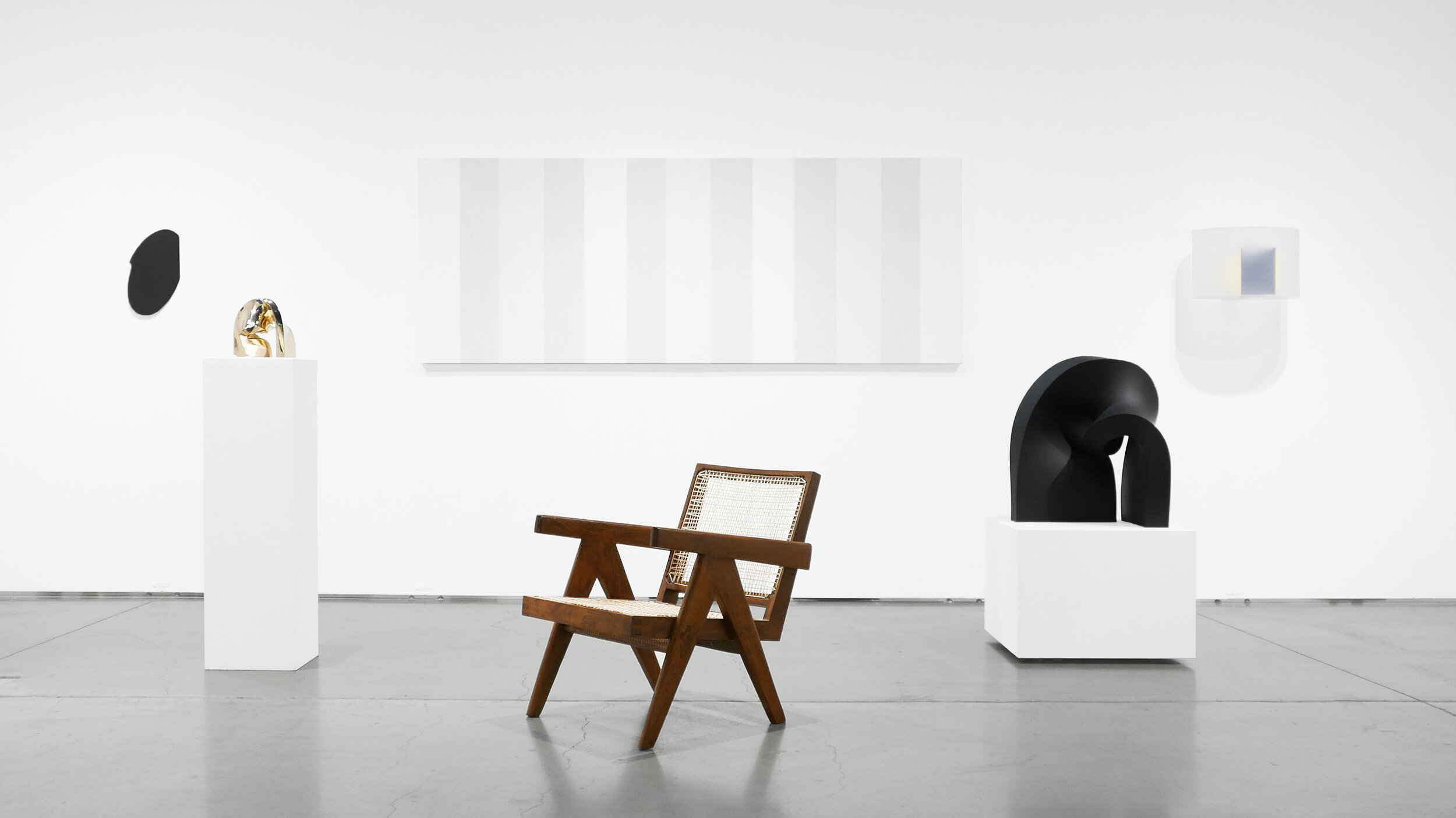
I love California impressionism. You can see the California light I’m talking about in William Wendt’s landscapes. Just as the California impressionists were drawn to this region, the Light and Space artists in the late ’60s and early ’70s were drawn to capture the light here as well. Rather than painting portraits and landscapes, however, they created their work using drastically different materials, such as resin, acrylic, automotive lacquer, and metal, so that their artwork could reflect, absorb, and refract the light itself.
I, just like the people that were drawn to California in the early 1900s, am drawn to this beautiful California light—the light streaming through the leaves and trees, glimmering on the ocean. When you think about the beauty and power of the light we have here, it’s not hard to understand how these artists could sustain this work for so many years.
How do you define California minimalism?
California Minimalism is less conceptually rigorous than New York Minimalism, but engages beauty in a way that is just as interesting to me. Meaning it’s not as scholarly and academic as the work of New York Minimalists like Donald Judd, but it is intellectual to me in terms of its sheer beauty, and the fact that it’s unaccompanied by the artists’ conceptual writing. While Judd serves you the dinner on a plate, these artists serve you just the dinner; You have to go and get the plate yourself. When you see James Turrell’s work, you’re just walking along, and then suddenly looking up through a ceiling. What are you supposed to write about that?
Part of recognizing the style is understanding that the materials weren’t simply chosen because of the way they interact with light, but they stemmed from the artists’ love for surfing and the car culture that was and is so prevalent in California.
Another thing to realize is that a lot of the artists came from this area. It wasn’t just Robert Irwin, Larry Bell, Craig Kauffman, and Peter Alexander living in Venice. Peter Alexander and Helen Pashgian used to hang out on the beaches in Laguna and Newport, John McLaughlin lived in Dana Point and Tony DeLap lived in Newport. They were all living here along the coast.
So West Coast Minimalism is also substantially more atmospheric in its references of the ocean, sky, and even smog of California. The unconventional materials and methods that the California minimalists used in their work come together as beautiful surfaces, simple shapes, and colors that evoke our deep history of life along the coast.
Photo Courtesy of Peter Blake Gallery
As both a Laguna Beach City Councilman and someone who has run a business there for 25 years, what do you love about Laguna Beach? What sets its design scene apart from the rest of the country?
There was a point early on in my career where I had the opportunity to relocate to a prime space for an art gallery in Beverly Hills. But when I thought about making that move, I realized I would be choosing financial gain over my quality of life. For me, success is about being happy and liking what you do. In the years since, similar opportunities have come up multiple times, but it always comes full circle: “Why go after the financial gain? So I can live in Laguna? But I already live in Laguna.”
It’s the most beautiful place in the world: The oceans, the hills, the weather, the diversity in the people, the rich tradition of the arts. There is a casual nature to design in California. Within the fabric of California design lays the influence of Spanish and Mediterranean styles and Hollywood glamour, with surf and hippie culture thrown in. Design here is under these eclectic influences that don’t necessarily come into play in the rest of the country.
Back when you were in the restaurant industry, you passed by a building that you instinctually knew would make a great gallery space. What about that original space inspired you so much?
It was late at night, and I had just been promoted to general manager earlier that night, so there was a celebratory feeling in the air, not to mention the artisanal California pot I was smoking, that made it more casual to think about. What is casual for me might be an absolute nightmare for a non-entrepreneur.
I wasn’t looking to open a gallery. I wasn’t looking to open any business at all. I was out celebrating a promotion. At the time I was in my late twenties and on the trajectory of working my way toward owning my own restaurant like my father and grandfather. But this space spoke to me. The building was lifted up off the sidewalk. And I looked up into it, and saw these great architectural lines. The way the space revealed itself through a series of geometric interventions was compelling to me. It had the same effect of looking at a sculpture, and I thought that it would make a great gallery. There was something intriguing about stepping out of the hospitality industry and stepping into the arts
I’m certain that a lot of the influence had to have come from living in Laguna Beach and being surrounded by all the art galleries and all of the artists. I could’ve easily thought I could open a restaurant in that space or a clothing space, but that space said art gallery and art was in the air. That’s not to say I wasn’t informed by restaurants. There’s enough overlap between fine dining and fine art, from my perspective. There’s a compositional element to creating a plate; the white space on a plate is not too different from the space on the walls of a gallery.
So, that night, the space, the promotion, Laguna Beach, and all these things aligned, and the next thing I knew, I was opening an art gallery.
Photo Courtesy of Peter Blake Gallery
When making the decision to become an art collector, where does one start? Do you have any advice for deciding on an aesthetic?
I don’t think it’s necessary to focus on a specific type of work or cohesive movement in art. The real focus should be on following your passion. When thinking about what you want to do with your collection, there is something to be said about the distinction between art collectors and art dealers.
In both cases, there’s obviously interest in art, but there are also a number of other factors that might drive you in different directions. You have to really want to be an art dealer. It’s a very difficult business; the average gallery lasts all of two years. The reason I bring this up is because there used to be a clearer distinction between the ways either operated, but circumstances have changed quite a bit.
It used to be that collectors were never dealers, while dealers were often collectors because it made business sense to also collect. But collectors today are becoming dealers in their own right, buying and selling works at auction. The lines have been blurred in this way because collectors now have access to the market in a way that was never afforded in the past. It’s not only easier to buy works at auction, but it is also easier to sell works from a private collection.
If I wanted to sell a painting twenty years ago, I had to have a gallery. Today, a painter can drop a painting on Instagram, the same way they would sell a car or something else. The online experience and the auction houses have opened this unprecedented access and this access has affected how and why people build their collections.
In the old days, people bought art for a lifetime; Whereas now, a lot of collectors are flippers, and are involved in the sale of artwork. People are also buying more on trend. The work they collected a few years ago becomes secondary, relative to the works they want to collect today; So they’re more likely to sell the work in order to modify their collection to fit their taste.
Photo Courtesy of Peter Blake Gallery
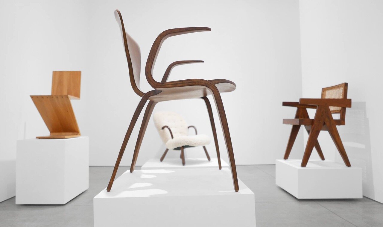
For your summer 2016 show, you showcased vintage furnishings that you and your wife had collected over the years. What can you tell us about how those pieces were collected? Did they all adhere to a singular style, or did their styles run the gamut?
My wife Stephanie and I built the collection over the years. We had always been interested in historical modern design, and decided to collect these works the way one would collect art. We were not necessarily interested for the sake of the decorative or functional aspects, but more-so about collecting a moment in history.
The collection runs the gamut, engaging modern history from Bauhaus all the way to the present, with Minimalism serving as the cohesive thread through it all. Our collection is probably the antithesis of Memphis, which is a highly respected and desired genre of design, but nonetheless something that I would never be interested in. We were drawn to more of a masculine, macho minimal style—rich, deep colors, dark woods, and an overall lack of whimsy.
For that same exhibit, you chose to restore the furniture to its original state, removing the patina and any signs of wear and tear. Why was it important for you to present those pieces in their restored state?
It’s the same reason Stephanie and I were attracted to collecting the works in the first place. I wanted the viewer to be taken back to the moment how the designer was seeing the realized work for the first time: In its absolute state of perfection, rather than under the influence of decades of patina and wear and tear. Basically, if you had hired me to design your phone, you wouldn’t want to show up to see a used phone with a cracked screen. When I show the work, I want you to say “That’s perfect. That’s exactly what I wanted.” That’s my approach to everything I display. Everything is meticulously restored.
In all honesty, to some degree, it affords me the opportunity to express myself artistically. During the restoration process, I get to oversee the transformation of these works through the hand and eye of the artisan restoring them. We discuss the materials that are being used and find areas that have not been exposed to wear and tear underneath or behind the surface of an upholstery. They allow us to see what the original was actually like, and guide us to restore the work to its original level of perfection.
There is however one exception: If and when I’m involved in restoration that involves fabric, the fabric does not speak to the original at all. The fabric houses I work with, Dedar Milano and more recently Sandra Jordan, are very artisanal by nature. I find myself gravitating toward unique and contemporary fabrics that speak to my love for abstract painting, rather than the fabrics that were originally used.
Photo Courtesy of Peter Blake Gallery
You also made the conscious decision to not display paintings near the furniture, as the paintings would take away from the design pieces. Why was this, and do you adhere to that same logic when assembling a room in your own home?
A few years ago I went to London and Paris, and saw the design and fine art worlds commingling. And I was impressed by it. But here in the States, those two worlds are completely separate. There is a clear hierarchy that is adhered to: You have art, then architecture, then design, and then decoration. When I started to design the exhibition, I was feeling nervous about commingling these two worlds because of the potential effect that it could have on my reputation: The strange territory of being branded as a fine art dealer showing “furniture.”
At home, you’re assembling a home environment. In the gallery, you’re displaying art and design in a way that relates to a historical context, not to mention a visual and conceptual context that has to be respected. None of the concerns about reception and context come into play in the home environment. As the installation progressed, I started to feel more comfortable about putting artwork in, but then felt that I wanted the design to speak for itself and not have to compete with art on the walls. So we made the conscientious decision to display the design pieces on pedestals to further this feeling that they were as much artistic and sculptural as they were functional pieces.
It was a truly major decision. Fine art dealers didn’t show furniture. I was very nervous. Even after coming back from Europe, it took me a great deal of time to start showing furniture. I didn’t want to endure another summer of tourists laughing at me. We had just finished restoring all the work, but then, once they were complete, they were wrapped up in storage. I had a very tentative feeling about how to display furniture in a fine art gallery. How are my colleagues and my artists going to deal with this?
When I finally came to terms with it, it then took nine weeks as I started to re-learn how to install. Installing furniture is very different from installing fine art. We then ordered pedestals, which changed the feel of the installation, so we had to redesign. We then had to order more pedestals and redesign again. Since then, I’ve been faced with the decision a couple more times, combining the two worlds in booths that I installed at both design and fine art fairs. I now feel extremely comfortable showing fine art and design as equally important. In more and more cases, design has become an integral part of fine art galleries’ programs.
You’ve stated in the past that you only buy and sell items that you love and would want to keep in your home. How do you determine which pieces to keep in your home, which to keep in your collection, and which to sell?
There is no difference between those three. I only buy and represent artists and objects that I want to own personally and want to display in my home. I never buy for financial investment or long-term gain. I never think about curators, critics, or contemporary perspectives when collecting. I’m always 100% true to myself and my own vision.
At the end of the day, I am a fine art dealer, and my actions have ramifications on the artists that I represent, but the only reason that those artists are in my gallery is because I want to own those works. Frankly, very few people get rich in the art world, and I’m not one of them. When I look back on what has made 25 years in the art world special for me, it’s the sense of freedom it has afforded me. In any other industry, this freedom is unattainable.
Photo Courtesy of Peter Blake Gallery
This feature was originally published on the DECASO Society Pages before the site’s migration to Chairish. Because the Society Pages are no longer available to view, I have added my features to my blog for portfolio purposes. All images have been approved for use by the featured gallery/designer for this particular feature.


